Composition Principles: Emphasis
Composition refers to the arrangement of elements within an artwork. Although art is largely an intuitive practice, by breaking down and putting a spotlight onto individual elements we can evaluate and elevate our art. This series focuses on the principles within composition, so you can cherry-pick your favourite ideas and level up your art practice.
Let’s dive into today’s topic: EMPHASIS!
Emphasis Defined
Contrast
An easy way to create emphasis is through contrast. Contrast is the juxtaposition of differences in order to intensify the properties of each. In art, contrast is achieved when opposing elements are arranged together to create visual interest and focal points. To dive deeper into contrast I cover how each of the elements (colour, line, shape, form, space, and texture) can be used to create contrast HERE.
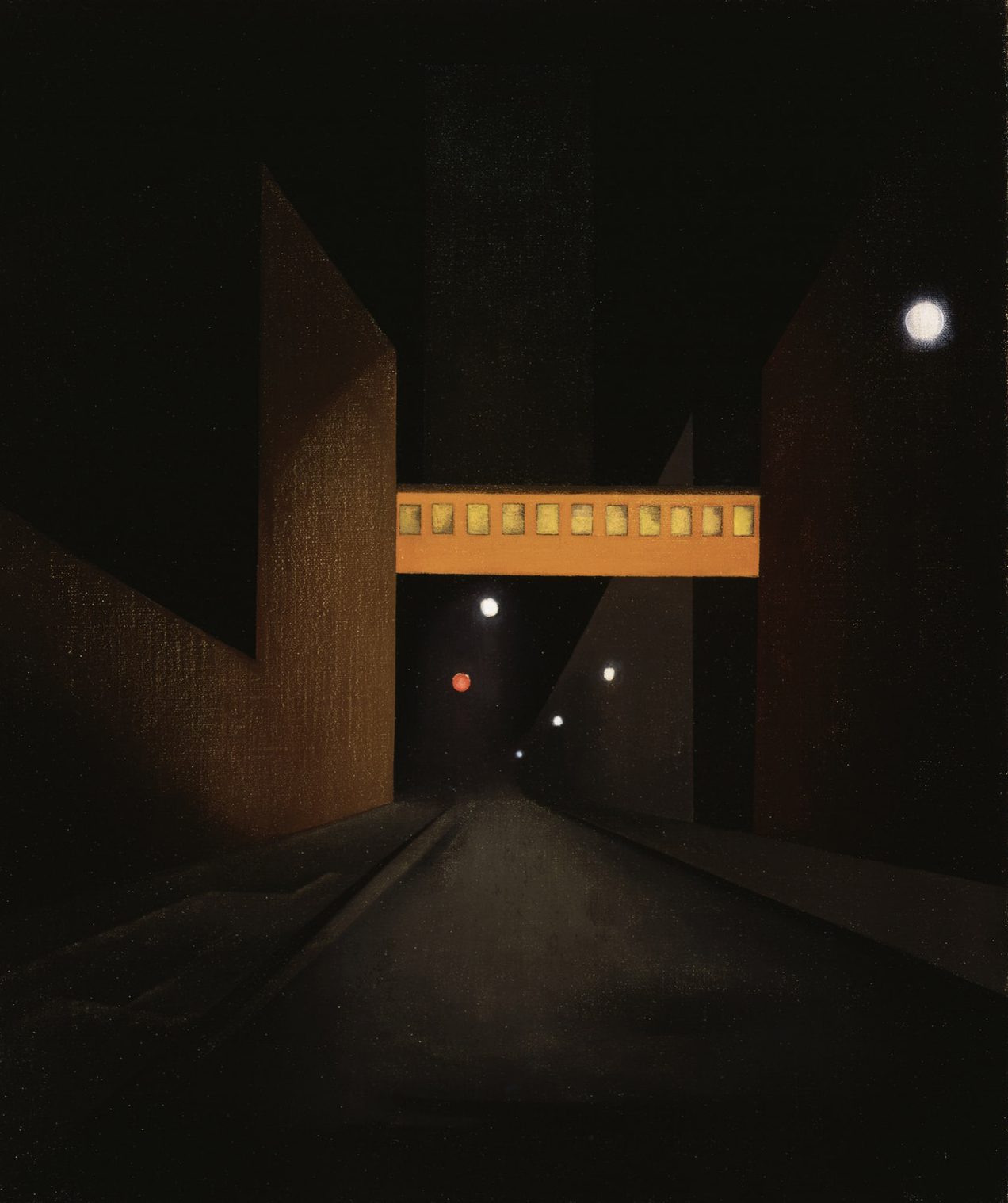
GEORGE COPELAND AULT – Sullivan Street
The emphasis in Sullivan Street is on the subway. It draws our eyes because the saturated orange contrasts against the remaining hues. The brightness of the orange also provides value contrast against the dark night scene. There is also an anomaly happening with the missing tracks – a concept I’ll cover later on in this post.
Rhythm
/repetition
A regular rhythm that repeats one element will naturally highlight the elements being repeated. It’s the opposite of contrast but it still creates emphasis. A good example are the works by Andy Warhol, often repeating images of celebrities and advertisements in bright colours to emphasis his message of mass culture saturation. You can learn more about repetition and rhythm HERE.
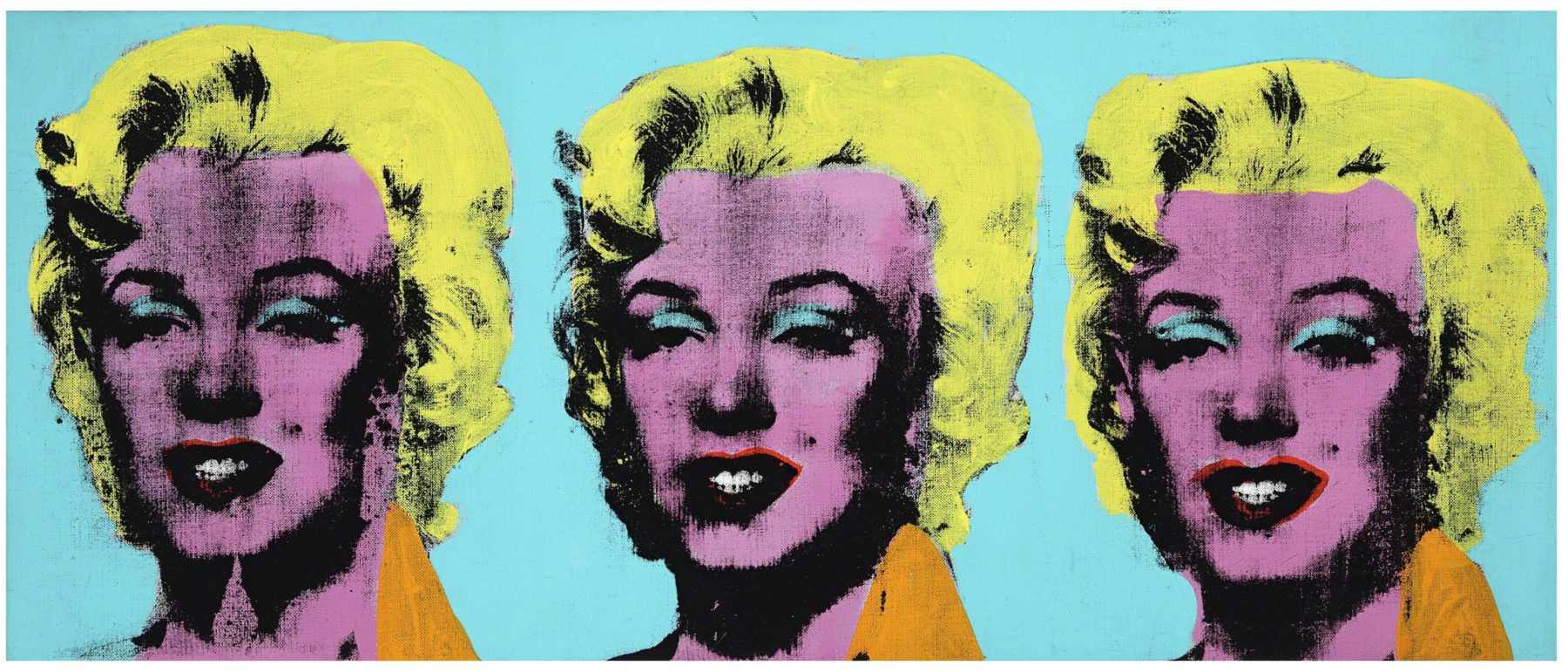
/interruption
If you interrupt a pattern, you’re introducing emphasis through contrast. The viewer gets a surprise and their eyes are drawn to the interruption. (source)
PLACEMENT
/Focal Point
A simple way to create emphasis is through the placement of your focal point. If you think of your canvas as a target the area that will command the most attention, is the bullseye aka the center of your work. You can learn more about proportion and placement HERE and an argument for not placing your focal point dead center 😛
(source)
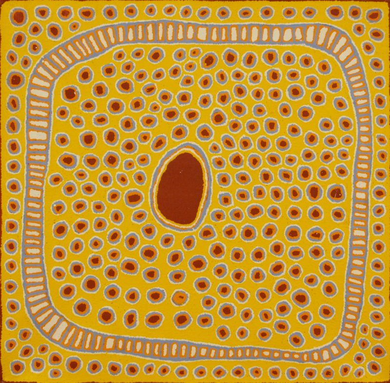
The auburn central shape becomes the focal point due to placement, size contrast, and value contrast against the yellow.
/Isolation
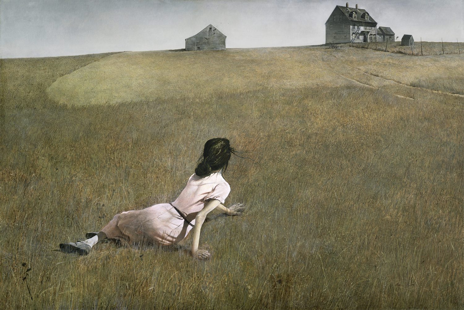
ANDREW WYETH – Christina’s World
Andrew places the figure in isolation. The vast negative space around the figure and the value contrast of her outfit to the field draws our eye to her. The second focal point would be the house, her gaze lead us in that direction along with the tracks in the grass acting as leading lines.
LEADING LINES
Leading lines are directions for your viewer’s eyes to follow. If successfully employed, leading lines can lead your viewer’s eye to the focal point of your work. (source)
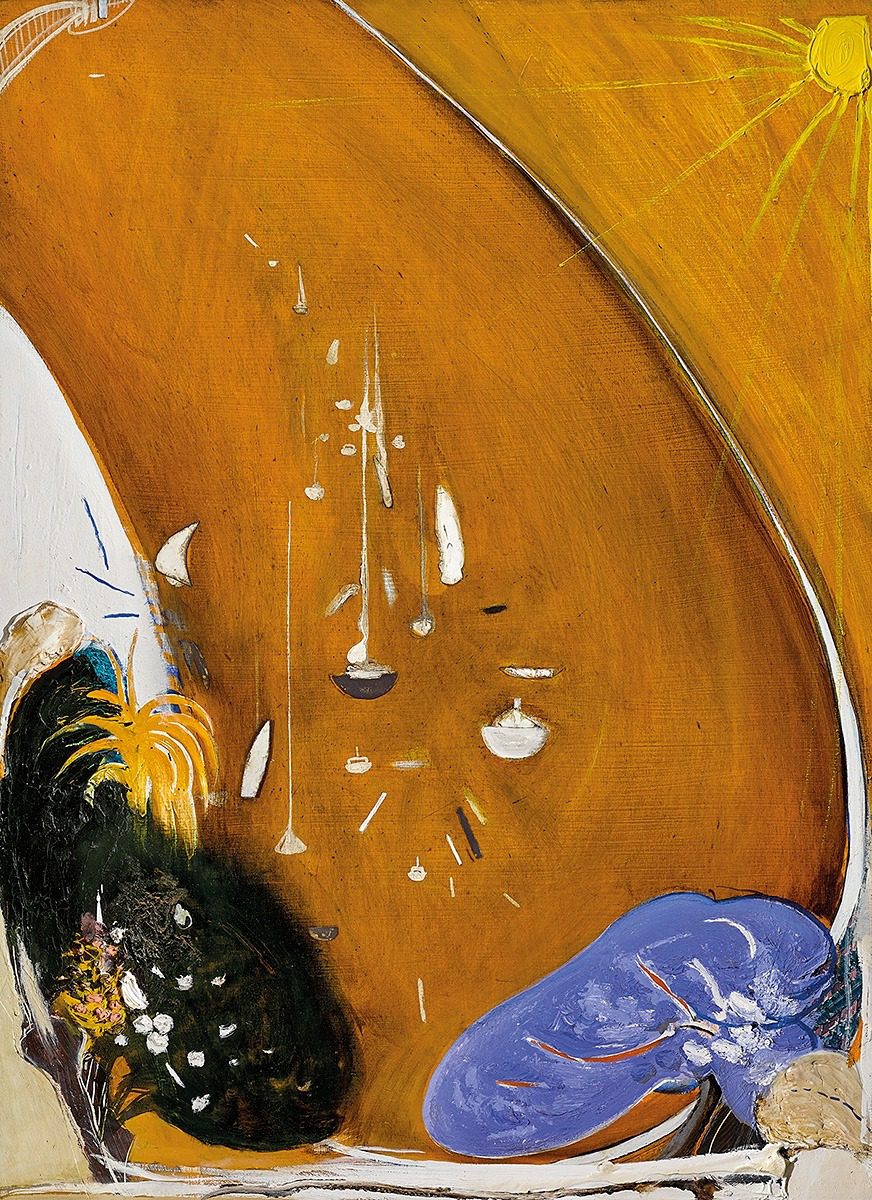
BRETT WHITELEY – In the Bottom Park at Lavender Bay there is a Jacaranda and a Gardenia Tree
The title of the painting tells us what Brett wanted emphasised – the jacaranda and the gardenia at the bottom of the piece. Our eye is drawn to the purple as it contrasts against the ochre and the dark gardenia tree uses value contrast. Brett Whiteley is known for his use of gestural linework. In the piece above he includes a sweeping line, for our eyes to follow, straight into the jacaranda.
Disproportion
If the proportions of a subject are incorrect an image will look unrealistic or abstracted – drawing emphasis. (source)

RENÉ MAGRITTE – La femme du maçon
Our eye is literally drawn to her eye because of its disproportion to the rest of the woman’s face.
Something that is out of proportion (as discussed above) is considered an anomaly but an artist can push the concept further by adding, into the composition, anything that is abnormal or out of the ordinary. Since our brain is wired to notice what is different first, it will automatically draw focus and grab our attention. (source 1/2)
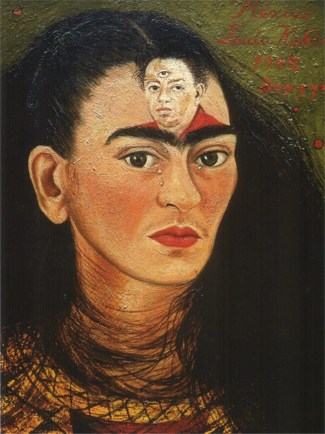
The eye is drawn to the portrait of Diego on Frida’s forehead. It’s out of place and thus become the focal point.
HOMEWORK
If you click this LINK a new tab will open with a famous artwork. Before you click on that new tab I want you to close your eyes, so when you see the art you’ll be able to catch what draws your attention first. This is something you can practice with any art and it will help you identify the focal points and emphasis within the work. I have my own interpretation below (if you’re curious) and remember a painting can have more than one area of emphasis.
Interpretation: My eyes are initially drawn to the orange sky, due to the contrast in colour saturation to the rest of the piece. I’m next drawn to the figure through the lines of the water leading into the figure itself and then the railing leads my eyes up to the reamining two figures.
–
Want to see what else I do? Come peek over on my insta or grab a freebie when you sign up to my newsletter below 🙂 🙂

