Composition Principles: Line
Composition refers to the arrangement of elements within an artwork. Although art is largely an intuitive practice, by breaking down and putting a spotlight onto individual elements we can evaluate and elevate our art. This series focuses on the principles within composition, so you can cherry-pick your favourite ideas and level up your art practice.
Let’s dive into today’s topic: LINE!
LINE DEFINED
Line is a basic element within art. Lines can be used to define the subject of a piece but also to create; movement, texture, value, emotion, perspective, pattern. A lot of these we’ll cover more in later posts but today we’ll look at line application and the idea of using lines to lead the eye.
LINE APPLICATION
Lines can be changed through:
/Length (long or short)
/Width (thick or thin)
/Texture (rough or smooth)
Different lines evoke a different sense:
/Horizontal (calming)
/Vertical (strength)
/Diagonal (excitement)
/Curved (graceful, movement)
/Zigzag (action)
(Source)
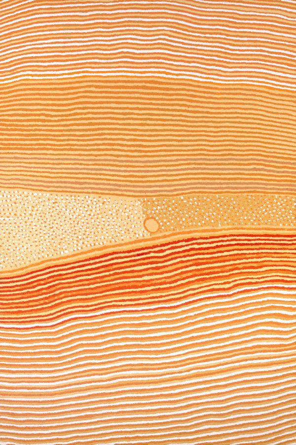
HELICOPTER TJUNGURRAYI – Wangkartu
The horizontal lines in Helicopter’s painting provide a serene calm quality to the work, whilst the slight curves add movement.
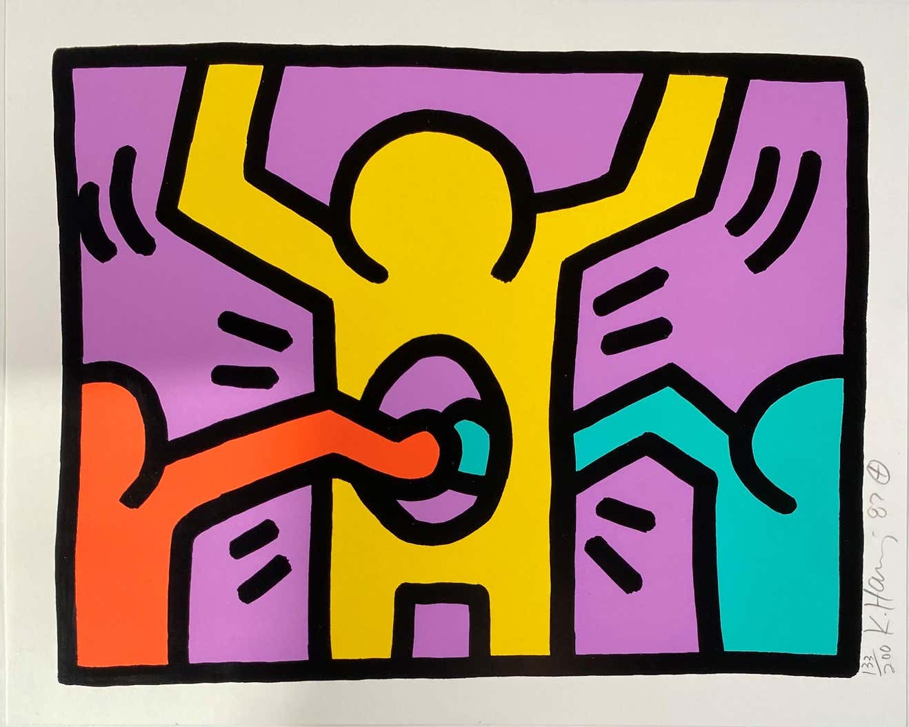
Working in the pop art movement, Keith is known for his thick black line style. In this piece the diagonal lines create excitement, the zigzag lines create action, and the curved lines movement.
Your line style is likely something you’ve developed over time and which comes naturally to you. It doesn’t hurt to step outside your comfort zone and play around with different line styles but if you really want to step up your line game, then you need to consider, leading lines!
LEADING LINES
Leading lines are directions for your viewer’s eyes to follow. If successfully employed, leading lines can lead your viewer’s eye to the focal point of your work and/or create a visual flow and a strong composition. The following artworks are great examples.
EXAMPLES
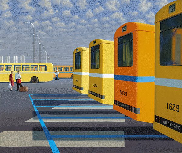
JEFFREY SMART – The City Bus Station
Painting in a meticulous style, Jeffrey’s work is often based on urban scenes with a sense of alienation. In the painting above the blue line draws us to the two figures whilst the other lines let your eyes dart across the bus lot.
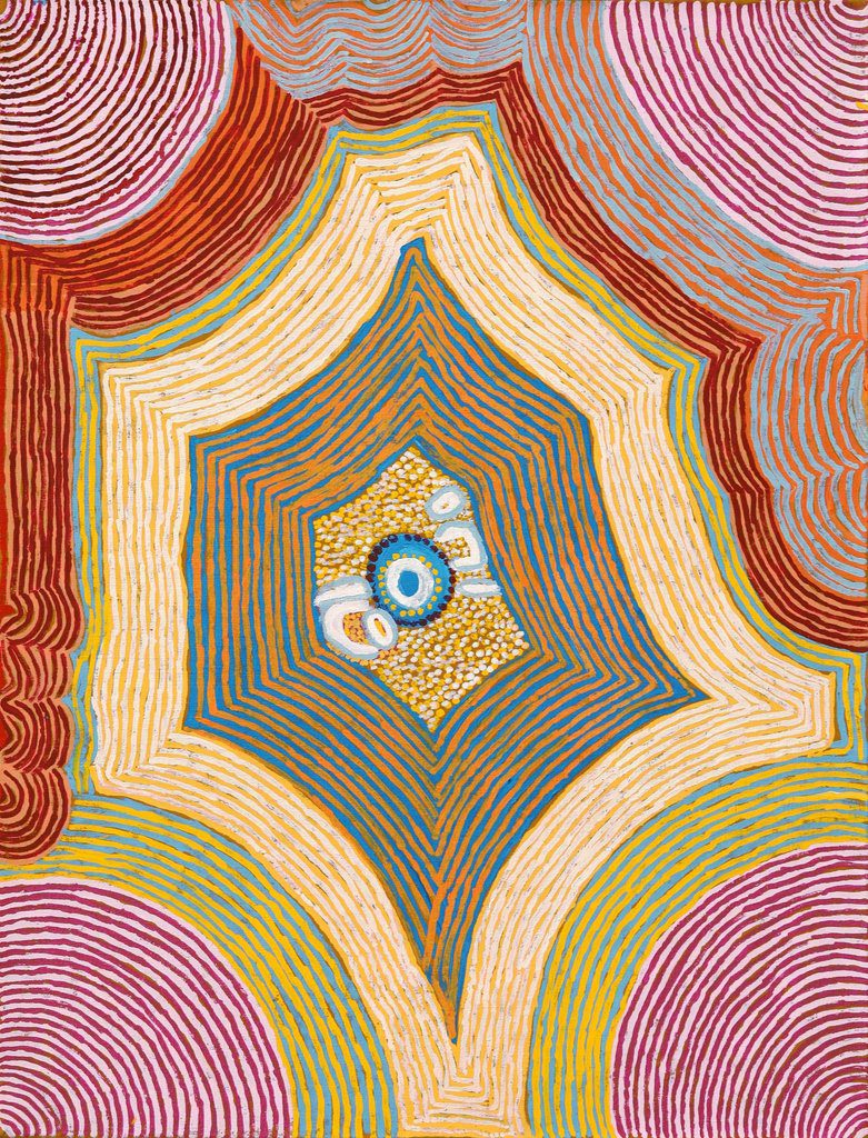
EUNICE NAPANDANGKA JACK, Deep Waterhole – Tjukurrla
Eunice’s painting does a wonderful job of using repeated lines to draw your eye to the center and then back out again. The curved lines create movement and the differing strokes offer an organic feel to the piece.

DAVID HOCKNEY – A Bigger Interior With Blue Terrace and Garden
David’s verandah scene leads your eye across the canvas from one side to the other.
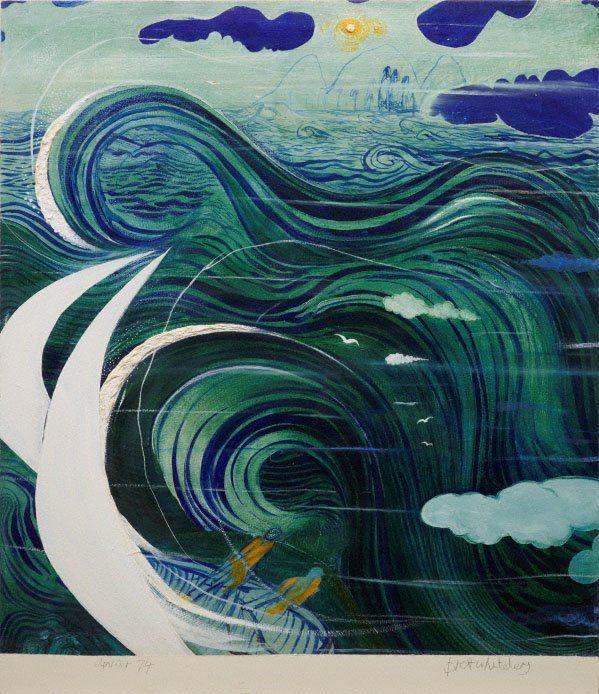
BRETT WHITELEY – Stanner’s dream
Brett Whiteley is able to create large amounts of movement and flow through his line use, creating a visual engaging artwork.
HOMEWORK
Your homework this week is to become an investigator, taking note of art that you love, and thinking about how your favourite artworks successfully incorporate line. The more inspiration you absorb the more you can translate the knowledge into your own practice and level up!
bonus point: start a line board on pinterest and pin art that successfully utilise line to create an engaging composition
–
I hope this quick dip into linework has got you thinking about the power of lines within art.
Want to see what else I do? Come peek over on my insta or grab a freebie when you sign up to my newsletter below 🙂 🙂


